Thursday, 29 September 2011

More modeling paste!

I couldn’t keep my hands of the modeling paste! There’s so much fun to do with it! This layout is about DD who loves to climb – she never misses one possibility to climb on whatever she finds that is possible to climb at…
(The layout is not supposed to be that brown in the lower right corner. But when I turned around I saw DD playing with my ink blending tool on the LO and it was brown ink on it… Not the way I wanted it, but a fun memory…;))
To capture the context where the picture is taken I wanted to have a lot of green and leaves in the background. First I played with a mask and different shades of green ink. (It’s kind of a messy background, but I think it looks like the sun filters through the leaves and it produces such a summery feeling…) I then blended green acrylic paint with modeling paste and created the fronds using a Crafter’s Workshop Template.
Here is another picture that really shows the texture of the fronds. The embellishments are a mixture of Basic Grey’s Sweet Threads and Bo Bunny’s Garden Girl, with a little ingredients of Crate Farmhouse and MME Lost & Foud II.
The branch behind the owls is a die-cut made out of a Crate Random paper.
Thank you SO much for looking! Your comments are SO appreciated!

Sunday, 25 September 2011

New clothes for the autumn

These pictures were taken when I came home with some new clothes that I bought for our daughter. She was so excited and tried everything on over and over again telling me which clothes that was matching :)

The texture on the background is made with modeling paste and a template. It’s the first time I've used modeling paste and I love, love, love it! I also used a lot of glimmer mists – both on the background and on the gorgeous embellishments from Prima.

I made the tags myself out of different scraping stuff. They are supposed to look like tickets (like the one you can see on her clothes in the pictures). The “tape measure” to the left, the sewing, and the sewing machine in the center of one of the flowers are other things that are supposed to go with the “cloth theme”. The grey flowers are colored with mist, ink and glitter stickles.

Thank you SO much for looking! I LOVE to read your lovely comments!!! And I LOVE to visit your blogs and get inspired!!!
I just want to remind you all that I’m giving away a RAK Prize over at ARTastic this month! Play along and you’ll have a chance to win a LOT of gorgeous prizes!!!

Tuesday, 20 September 2011

One layout and one birthday card

The lady on the picture is a close friend of my husband’s family and she was almost like a “second mother” to him when he was a young boy. She is very fond of him and of our little daughter so I thought I should do a layout as a present for her. I think she looks so fab in this military green linen suit (she’s 86 years old, you know)!
I have used a lot of products from Basic Grey’s Out of print here as I thought it matched the green suit. I also used some new dies from Spellbinders that I really love (Ironworks motifs). (They are gorgeous when you do the dry embossing too). The title of the layout says “A wonderful day!”


I also made a birthday card for my father in law to his 80th birthday. I played a lot with glimmer mists, ink pads, distress ink, stamps, 80 as a mask, and embossing. To the left you’ll see some of Prima’s Resistant canvas – another new favorite product for me.

Thanks a lot for looking!!! Your comments make me SO happy!!!

Friday, 16 September 2011

Before & After

On this layout I wanted to play a little bit extra with “paint”. As the background is already so beautifully colored (Sassafras Sunshine Broadcast) I had an idea of making a white “frame” around the pictures and then to color it with glimmer mist.


First I painted gesso on the background and on some chipboard. Then I added some white embellishments (die-cuts, colorable flowers and trim) and sprayed it with pink, yellow and turquoise glimmer mists (the same colors as on the background paper). I also added some embellishments from the Sunshine Broadcast collection.


To be able to make layers like this you should put the white embellishments in exactly the right place without gluing it. After you have misted it you can lift them up and place some other embellishments under them. I don’t know what you think about the final result, but I had a great time making it!!!


(The pictures are of our daughter before and after her haircut.)

Thank you SO much for looking!!! And thanks for all the lovely comments you are leaving me!!!

The gorgeous butterflies in the upper right corner are from K & Co.

Wednesday, 14 September 2011

Playmates

I fell in love with these papers from Authentique when I saw them in a sneak peek in July. I thought they looked just like old scarves… and I love old “aunt scarves”! I finally got hold of them and thought the “scarves theme” and the colors were perfect for this picture of our daughter playing and dressing up with her friend. I also thought that all this was perfect for the September Challenge over at Scrap the Girls.
The challenge is to use clips on the layout. I think any clips would go with the theme of this layout but these who look like clothes hangers from Tim Holtz are extra suitable!

I wanted the papers to look like different scarves hanging behind the picture. To get them the way I wanted I first draw them by hand on a white cardstock, then transferred them onto transparent paper and finally onto the patterned papers. I choose to cut them in layers as paper piecing to get some structure.
The background is colored with Aridondack Color Washes (thanks Leonie for the inspiration – I bought some straight away!) and acrylic paint.


The clothes hangers (clips) and some beautiful buttons are hanging on a thick, colored thread underneath the picture.

Thank you SO much for looking!!!

Monday, 12 September 2011

Grandma

This layout is kind of special to me as I’m going to give it away to grandma (my mother in law). The papers, chipboard, buttons and trims are mostly from Crate’s Random collection.

The background is sprayed with different shades of green. I also stamped some green flowers.


Thank you SO much for looking!!! Your lovely comments make me SO happy!!!

Wednesday, 7 September 2011

Cool in sunglasses

I fell in love with the colors in the Soiree collection and have been thinking about doing a layout with those papers during the whole summer. But so many fun challenges came in between…
I love the expression on our daughters face on this picture. You can see it on her mouth – she feels so cool when she puts on her sunglasses!

I found these kitschy butterflies in a web shop and just loved them. They match the soiree collection perfectly.
The background is decorated with yellow mist, a homemade mask and acrylic paint.


Thank you SO much for looking!!!

Tuesday, 6 September 2011

So fun to sleep in the cottage!

This layout is made for September Challenge at Kraft it up! The challenge is to use fabric or stitching on the layout. So fun! I love that, but for some reason I don’t do it often. So I take the opportunity to do it now!

This picture is taken when our daughter should go to bed in her grandparents’ cottage. She was so thrilled and thought it was so exciting. Watching her woke a lot of good memories for both me and her father. We both felt the same way when we were kids and were to spend the night somewhere…


As this memory is from a cottage I wanted the layout to have sort of a country feeling. I thought it was suitable with fabric and stitching. The fabric strip comes from an old pair of jeans. I stitched it onto the cardstock with a machine.

I also stitched the letters in the title to make it look like a banner.


The journaling and the beginning of the title are found on the top left.

The flowers are made with dies and colored with ink. The background is decorated with ink, a mask and acrylic paint.

Thank you SO much for looking!!!

Sunday, 4 September 2011

Guest DT at ARTastic!!!

I’m SO excited to be the Guest DT at ARTastic for September! I have joined every challenge there ever since I found the site and I just love it! There’s something special about their challenges that really appeals to me! So being their Guest DT is so extra fantastic!!!
I also love the possibility to give away a Guest Designer RAK Prize!!! This is what it contains:

And there’s a LOT of additional prizes to grab!
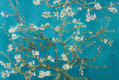
The challenge is incredible (as always)! The inspiration comes from the painting ‘Almond Blossom’ by Vincent Van Gogh. Isn’t it marvelous? It touches my heart!

For extra bonus points you should also have a:
1.    Blue background = 1 pt
2.    White flowers = 2 pts
3.    Brown or white title = 3 pts
I hope you will join in! I’d love to see how you interpret this!
This is my interpretation:

The title of the layout is “Child of Nature” (written with brown alpha stickers). I also thought that this vellum piece and quote suited the theme of the layout perfectly – “One touch of nature makes the whole world kin” by William Shakespeare.

The blue background is made with glimmer mist. I also made some white flowers with a mask and white ink. The flowers are also embossed.

I also added some Prima Craftable Flowers that I decorated with acrylic paint and Glimmer Glam. The center of the flowers are Bo Bunny's Et Cetera Button, Bo Bunny's Garden Girl Trinklet, and Webster’s Sparklers.


Thank you SO much for looking! I must add that one more reason that I love ARTastic is that you meet so many nice persons! I hope you will leave a comment when looking – it makes my day :)

Friday, 2 September 2011

Out on a hike (Knoppe)

This is a picture of our daughter and her friends going out on a hike with their teacher. They are only two years old and look so adorable with their rucksacks. And they feel so grownup when they are allowed to leave the nursery school to go outside the fence. (My Swedish readers might know what “Knoppe” is. It’s like “Mulle” but for younger kids.)

On this layout I used a lot of different embellishments that I “hid” in the vegetation. The flowers are cut with a Tim Holtz die.


The background is sprayed with yellow and beige mist. I also used dark red and copper ink on the flower mask.

The fence is a chipboard that I decorated with a Basic Grey Oxford paper. Actually most of the papers are from the Oxford collection as I will submit the layout to a Basic Grey Product Challenge at Two Peas in a Bucket.  I also used one patterned paper and die cuts from Pink Paislee’s Butterfly Garden. The alpha stickers underneath the fence are colored with dark red ink to get the right color.


Thank you all for looking! I think it’s so fun to meet you out there in cyberspace!