Sunday, 20 November 2011

A fun memory

I love creating on kraft paper and I love journaling so the ongoing challenge at Kraft it up! is perfect for me! The challenge is to show your journaling in a creative way. Fun! This is what I came up with:
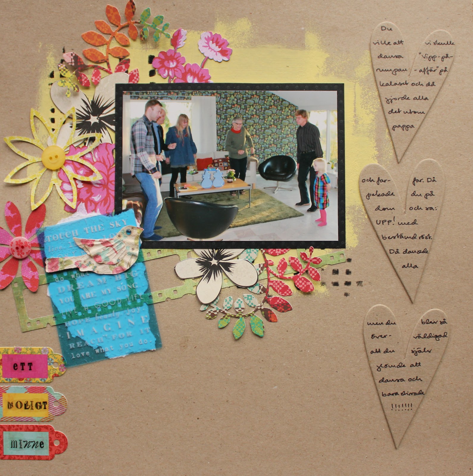
I chose a picture that captures a fun story that I want us all to remember. It needed a long journaling and I chose to write it on three chipboard hearts. As the chipboards had exactly the same shade as the craft paper I loved the effect of keeping them undecorated.
The title is written on some tags from Basic Grey and says: “A fun memory”.
The background is decorated with some yellow acrylic paint and black ink on a template. The embellishments are a mix of bright colors and black & white.

The transparency is from Glitz. It has a wonderful bright color and to be able to keep that color on a kraft paper I chose to put some white paper behind it.

Thanks for looking!!! I love your comments!!! :)

Wednesday, 16 November 2011

Children’s party

Remember my celebration challenge??? When I went back to my new job after my pneumonia I thought that why not do a layout myself in those colors? (I’m not competing of course). I chose to add some red and orange as the door to my office is red and the sash is orange. Well… I thought it was a great combination…;) You can read more about the challenge and the prize here.
The picture is taken on DD’s children’s party.
All the yellow/grey/black/white fuzzy-cut flowers and papers are from Authentique’s collection Blissful. The background is decorated with yellow mist and grey Distress Ink on a Crafters Workshop mask.

I made the orange flower to the left myself. The red flower to the right is cut with a Tim Holtz die.
I also added some cute playing children fuzzy-cut from a October Afternoon paper.

Thank you SO much for looking (and leaving comments)!!! I REALLY hope that you got inspired and that you will run to your scrap places and start creating! ;) LOL! The deadline is the 4th of December.

Monday, 14 November 2011

Create with postage stamps

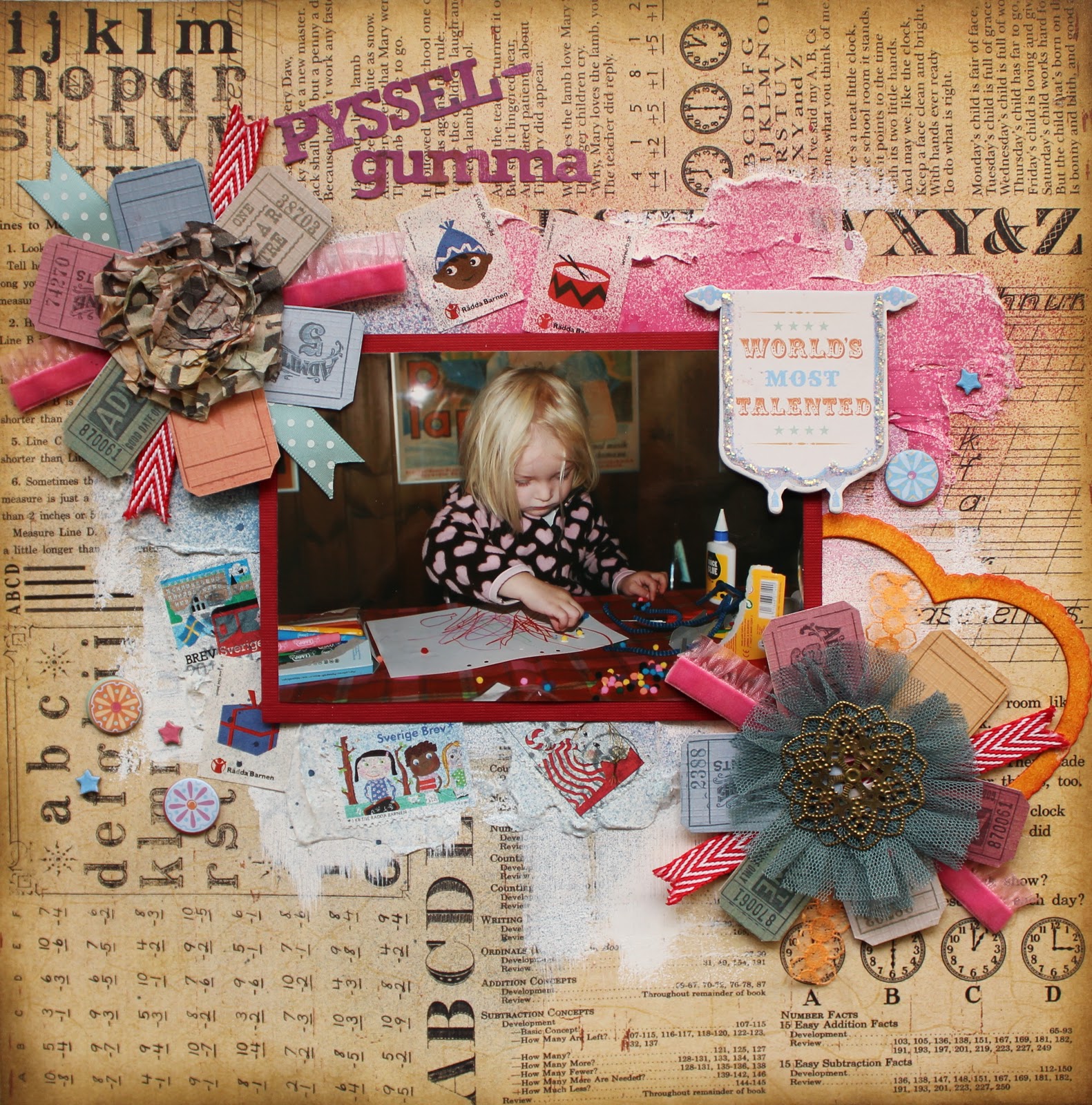
I did this LO for a challenge that Chantal Vandenberg is hosting at Do more with less. The challenge is briefly to use postal stamps on your background and to mist over them. I thought it sounded fun and it fitted with this picture of DD crafting.
I added some white gesso and modeling paste on the background (pp from Prima) and pressed the postal stamps into the modeling paste before misting.

I also made two “flowers” out of tickets and trims to strengthen the crafting theme. The center of the “flower” to the left is made with tissue tape from Tim Holtz colored with different Distress Inks.
The center of the “flower” to the right is made with trim from Webster’s and a metal decoration. I also added a chipboard heart colored with Distress Ink and a chipboard from GCD Fun House that I decorated with some Distress Stickles.
Thanks for visiting! And thanks for all the lovely comments you are leaving here at my blog!

Sunday, 6 November 2011

Father’s Day Card

Father’s Day falls in different days in different countries and in Sweden it’s on next Sunday, the 13th of November. I made this card for my father and it says “The best father in the word”.
The “newspaper” was black and white and I misted it with three different colors. The small flowers is cut with a die from Tim Holtz and painted with Distress Stickles, the other flowers are fussy cut from one of Prima’s Christmas papers and decorated with some extra bling.

Thanks for looking!!!

Thursday, 3 November 2011

Anyone’s up for an extra challenge this month???

I have a lot to celebrate!!! First I got a new job – a top job that I’m SO happy about! Second I just became a member of ARTastic’s Design Team! And third, my blog will soon have its first anniversary! (I’m also celebrating that I’m about to recover from a severe pneumonia).
I’m SO super happy about all this and I want to share it with you!!!
So I will have a challenge here at my blog where you will be able to win a lot of goodies!!! As the colors of my new employers are yellow, black and grey my challenge is to create a layout using those colors. You can also include any other colors but yellow-black-grey should be dominant.
What do you think about that? Fun, I hope!!!
If you want to join in just leave a message at this blog post with a link to your own blog post. If you don’t tell me not to – I will also post a picture of all the entries here at my blog when the challenge is over. I will then draw a winner. If you’re not up for a challenge and there are no entries I will draw a winner out of my followers anyway! The challenge will run until the 4th of December. You’re welcome to join where ever you live in the world. I’ll pay the freight.
Picture of the prize:

I really hope that you want to celebrate with me!!! Hugs from me to all of you!!!

Wednesday, 2 November 2011

DT at ARTastic!!!

I have some great, great news!!! I have been asked to be part of the DT at ARTastic! It’s a dream come true for me as I LOVE ARTastic’s challenges! It’s actually the first challenge site I played along with (and I have joined in every month since then).
This is my first layout as a DT:
The challenge is to get inspired by the painting Bacchus by Caravaggio. To get some extra bonus points you should also try to work the following into your page:
1. Fruit or grapes on your page = 1pt
2. Wine glass and/or bottle on your page = 2pts
3. A bow = 3pts
As I couldn’t find any grapes or fruits that I liked I decided to make my own. I draw them by hand, cut them out of patterned papers and used some Distress Ink to make a 3 D effect. The grapes are made using Paper Piecing technique.


I hope you like my take on the challenge! And I hope you pop over at ARTastic to look at the other DT-girls awesome work!!! And when you are there – look at all the goodies you can win! I would love to see you play along and to have the opportunity to vote for you!!! ;)
Thank you SO much for visiting my blog and for leaving all those lovely comments!!!

I wanted to capture the feeling and the colors on the painting and used Glimmer Mists in dark brown, dark green and dark purple on the background. I also used some black Distress Ink on a mask from Pink Paislee. The white doily is representing the fabric on the painting. As the pictures are taken in a cottage in the countryside and not in a “Baccus milieu” I added some tree patterned paper as photo mats and some deer.
Here’s some close-ups:

Sunday, 30 October 2011

One more monochromatic page!

Over at Kraft it Up! there is a challenge where you can choose between 3 different styles: monochromatic, minimalist or vintage/romantic/shabby chic. I chose to create a monochromatic page in green.
The pictures are taken when DD met this guy called Mulle for the very first time. Mulle is a well known figure in Sweden who lives in the forest and tells the children to take care of nature and things like that.
The frame and the hanging branches are Prima Mistable Canvas. I colored them with 3 shades of green Distress Ink.
The deer is made with a die from Tim Holtz. I had some green Distress Ink on its edges and stamped some music on it.
The background is decorated with different shades of green Glimmer Mists and Distress Inks.
Thank you SO much for looking!!! And thank you all for your lovely comments!!!
I also want to thank you DT-girls at Kraft it Up! for giving me Honorable Mentions!!! It really makes me happy!!!

Saturday, 29 October 2011

Black & white at WW1

The color at White With 1 this month is black. To create only in black and white sounded challenging and fun so I decided to give it a try. I wanted to use a picture in color and thought that this one of DD playing had suitable colors.

To decorate the background I used black mist and Distress Ink on a mask from Pink Paislee. The photo mat is painted with black gesso. (The challenge is also to use paints/mists).

The black flowers are made of tissue paper and brads from My Mind’s Eye Lost & Found. The other flowers are made of brads (same brand) and muslin colored with black Distress Ink. The branch is a mistable canvas from Prima colored with the same ink.


Thanks for looking!!! And thanks for leaving comments!!!

Sunday, 23 October 2011

Scary picture

Over at ARTastic there is a fantastic challenge this month. The inspiration painting (Dr Jekyll’s Hideway by Maryanne Jacobsen) has the most wonderful vibrant colors and I just couldn’t resist creating a background with those colors. But it was quite a struggle for me because I don’t have any Halloween pictures. But I took this picture of DD recently and I thought it looked spooky when I saw it. It was really foggy that day and I guess that’s why she looks so pale (as a ghost).

To get some extra points you should include a house, trees and a spooky fell on your layout.
I started out “painting” my background with Aridondack Color Wash from Ranger. To create a tree a used a mask and some dark grey mist.
The house is fussy cut out of a patterned paper.
To create more of a spooky feeling I added an owl and some bats. I made the bats myself, just drawing them on a paper and then cutting them out.
Thank you SO much for looking!!! Your comments make my day!

Sunday, 16 October 2011

Our little aunty

DD loves to dress up like an aunt and I thought that this colorful picture worked well with some colorful background paper and embellishments. This layout is a mismatch of new and old stuff and different brands.
Even though the background is a patterned paper I wanted to color it some more. I used a mask and four different shades of Distress Ink to make the flowers. I also splashed on some green Distress Stain.
The blue frame is a transparency (Peek-A-Boo) from Glitz that covers the whole picture.
Thank you SO much for looking!!! Your comments makes my day!!!

Monday, 10 October 2011

Scrapping

As you could expect DD loves scrapbooking. A couple of weeks ago she said her first word in English – and it was scrapbooking! :) On this picture she’s making the flowers for this layout (no, I didn’t make them myself…).


The LO is made out of a mix of different brands and collections. The big gorgeous flowers are cut out of an old Glitz paper. I decorated the leaves with some rhinestones. You’ll also see some Prima products, more Glitz papers and a Bo Bunny die-cut. The background is a black and “white” pp that I decorated with black gesso added with a piece of well pap.


By the way… DD made her own invitation cards for her 3-year birthday party coming up soon. Here’s a picture of two of them…

Thanks for looking! And thanks for your lovely comments!!!

Thursday, 6 October 2011

Beloved My

May I introduce to you our fourth family member – our cat called My! As this picture of DD and My was “without any color” (and the LO is not made for any challenge) I was free to choose whatever colors I wanted. FUN!!! I chose different shades of cerise, terracotta and orange – colors that really clash with each other! I also added a little bit of gold.
I love this cardstock. It’s like kraft in its structure, but much lighter (the color on the picture is correctly reproduced). I added some white gesso on it and splashed some acrylic paint in gold. The embellishments are from Basic Grey’s ‘Out of print’, ‘Indie Bloom’, and Glitz. I used 3D tape between the two photo mats to get an effect and to be able to put the trim in between them.
The hearts are chipboards covered with Glitz paper.
My is written with Mist-A-Bles Chipboard Alphabet that I colored with dark cerise Glimmer mist and orange Distress ink.
Thanks for looking!!! I love all the lovely comments you are leaving on my blog!!! Thank you SO much!!!

Saturday, 1 October 2011

Hemerocallis

This summer we visited a lady who is an expert on Hemerocallis – my favorite flower! She had a whole field of flowers and I took a picture of DD in the middle of it. The afternoon light makes the colors even more beautiful and I just love this picture. So I wanted to do a LO that really captured those colors!


This time I kept the background simple (just to shades of yellow glimmer mists) and let the big flowers “do the work”. The poppies are die-cuts from K & Co and the other big flowers are made out of Authentique Blissful papers. I also used some word die-cuts from Authentique and some butterflies from Bo Bunny and Pink Paislee.


These flowers are made with dies from Tim Holtz, Authentique papers and some Mouslin colored with ink. The centre is filled with Glossy accent. There is also some Daisy rub-ons hiding.

Thanks for looking!!! I’m so super happy that you want to visit and leave comments!!!