Wednesday, 25 December 2013

Saint Lucia

This layout shows DD and her friends at kindergarten celebrating Saint Lucia. The picture is taken 2013 when it was -18 Celsius degrees! It was far too cold to be outside and I wanted to create a layout with a frosty feeling to remember that. That’s why I used an edited photo and only white, grey and beige colors.

 
The stamp at the left is sponsor material from Vida stamps. The pearls that I used to create an arrow pointing at DD from the top are sponsor material from Inkido. So are the pins with stars underneath the photo. The stars made by Birch bark are made by Hozzan. Here are some close-ups:


Thanks for popping by! Merry Christmas to you all!!

Sunday, 22 December 2013

Christmas morning

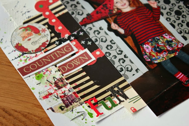
Here is another DT-layout for Allt Om Scrap. The challenge is to create a layout using two different papers as a background. I used part of a paper with a huge Santa, part of a paper with texts and a white cardstock. (I know it’s three, but it looks like two...)


Here are some close-ups:


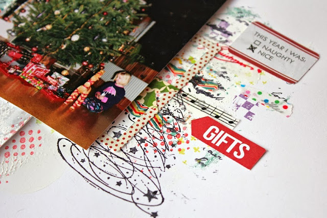
The cool Christmas tree stamp is sponsor material from Vida Stamps. :)
 
For those who speaks Swedish we have a DT-call at Allt Om Scrap. Jump over here to read more!
 
Thanks for looking!! Merry Christmas to all of you!

Wednesday, 18 December 2013

Christmas stocking

This is a DT-layout for Allt Om Scrap. The challenge is to create a layout with a Christmas theme using nontraditional Christmas colors. I used pink, apricot, orange, yellow and purple.


Here are some close-ups:

 
Thanks for looking!! Merry Christmas to all of you!

Sunday, 15 December 2013

Chrismas decoration

This month I was lucky enough to be sponsored by Inkido and Vida Stamps trough Allt OmScrap. This is a mini album from Inkido and I used it to create a Christmas decoration that I can use every year. All the photos are taken on the 24th of December when Santa visits us here in Sweden. There are one photo from each year since our daughter was born so you can see her growing up and enjoying Christmas. I wrote the year on each page.
 
Here are some Close-ups:


Thanks for looking!!

Thursday, 12 December 2013

Decorating for Christmas

This is a DT-layout for Punky Scraps. This December we want you to create a layout including sparkles, mix of alphas, 2 staples and a fun photo. I missed the sparkle thing... :( But I used a fun photo, mix of alphas and I did a fun arrow with the staples. Do the staples sparkle? Maybe in the right light?

Here are some close ups. You’ll find the staple arrow in the bottom center on the first photo. Can you see it? It's pointing at the word "fun".


Thanks for looking!!

Tuesday, 10 December 2013

No.1

This layout is made for a challenge at Allt Om Scrap where you are supposed to create something using cork on your alter. I have cut out the numeral one and together with the brad you read "No 1". The layout is about DD who loves to run - she is always running everywhere.

 
This month the talented Dani Cristina is our Guest Designer at Allt Om Scrap. Pop over here to have a look at her – and the rest of the design team’s inspiring interpretations!
Thanks for looking! Take care!

Sunday, 8 December 2013

Our own sledding hill

For December you have two awesome color combinations to choose between at Kraft It Up! Eigther kraft, white, pink and gold or kraft, white, aqua and silver. I chose the last one and made a laout with a winter theme. It's about the fact that we have our own sledding hill in our garden. :)

 
 I used some gesso, mists and stamps on the background.


As I did'nt have that much silver-stuff in my stash I also used some silver glitter on the background. I added it in the same way as I'm usually adding acrylic paint...


Thanks for looking! See you around! :)

Friday, 6 December 2013

Merry Christmas

It's December, which means it's Christmas on all challenge blogs. Which means it's Christmas over here too. :) I am starting with my DT-layout for ARTastic. It's actually the last Christmas layout I created this year and I was quite tired of all Christmas themed scrapbooking stuff by then (even though I looove them). For that reason I decided to create this one using a lot of paint, ink and stuff and a minimum of Christmas scrapbooking stuff. (In Sweden Santa visits on the 24th of December and that's why I used that number. Well, enough talk... Here's the layout:
 
 
The challenge picture is a Wordle, and the theme is Christmas.


And here are some Close-ups:


Thanks for popping by!! Have a wonderful weekend!

Saturday, 30 November 2013

Summer and pastel colors for TCR # 164


Here’s a layout that I made for The Color Room at the end of my guest DT term. It’s a summer layout and I better get it published here because the reason I have not published for a while is that I have been busy creating A LOT of DT-layouts for December. So it will be a lot of Christmas around here soon...

But first it’s summer. In lovely pastel colors. Mmm... I want it to be that warm and sunny again...

 
Take a look over here for some gorgeous inspiration!

Thanks for popping by! Have a nice weekend!! :D

Wednesday, 6 November 2013

Always curious and eager to learn


A new month means new challenges! This moth the challenge over at Kraft It Up! is to use flairs, wood veneers or enamel dots – on kraft paper. This is my DT layout:


I used both a flair and wood veneer arrows. I also used some acrylic paint, mist and stamps to decorate the background.


The title is “always curious and eager to learn” which is true about DD. The photo is taken on a ship at a marine museum. I thought she would find it boring but you can see how interested she is even in the machine room. She kept asking questions about everything she saw...

Kraft It Up! is having a design team call for the term between February and July 2014. You can read more about how to apply here.

Thanks for looking!! Take care!

Thursday, 31 October 2013

Our little witch

Happy halloween, everyone! Here's a layout showing our little witch that I made for Allt Om Scrap:
 
 
The challenge was to create a layout on a halloween theme using neon colors. I used thee different neon acrylic paint on my background. I don't know why the orange color look so ugly but it's a normal neon orange color IRL. ;) The flair button and the stamp showing skulls are from 3rd Eye.
 
Here's some Close ups:


Thanks for popping by! Have a nice weekend!!

Friday, 25 October 2013

Teatime

Oh, I almost forgot to show you... Here’s my DT layout for ARTastic in October. As usual there is an art piece to inspire you. This time you should also add some wood or feathers (real or otherwise). I did both as I used a wood veneer feather. I stuck to the colors in the painting as I loved the color combination.


ARTastic has the most awesome challenges and if you are not entering their challenges already I recommend you to start doing it. They are really inspiring! If you would like to be a guest designer or to be part of our design team you have a chance right now! There’s a GDT and DT call going on until November 6. You can read all the details here.

Thanks for looking! I wish you a wonderful weekend!!!


Saturday, 19 October 2013

Sponsored by InkyWings!

This month part of the design team at Allt Om Scrap is sponsored with flairs by InkyWings. I’m among the lucky ones and this is what I created:

The flairs from InkyWing’s have a modern and fun design and they fit perfect to my pages! I wanted to put the flairs in the center so I used three of them and placed them together.


Thanks for looking!! Take care!

Tuesday, 15 October 2013

At the same level

I love the challenge over at Punky Scraps this month!! The inspiration piece is really inspiring and I love to use stamps – so this was really a lot of fun to me! :) I actually used six different stamps on this one. I guess you cannot find them all but that are the way I like it.
The photo I have used shows an art piece called “At the same level”. It was a ladder and a plateau that made it possible for you to climb up at the same level as the statue of this Swedish king Karl XI living in the 17th century – and to look out of the city in the way he does (if a statue can do that).

(I don’t like to photo my layouts in sunshine but I only had one afternoon, the sun was shining and time was running out… so it had to be this way…).
Thanks for popping by!! Take care!

Tuesday, 8 October 2013

Ringsjön Runt

This layout is made for a challenge at Allt Om Scrap where you were supposed to use vellum embellishments on your layout. I suggested that we should have a challenge with vellum embellishments after I had seen the sneak peeks on the new atumn/winter collections. There were so many awesome vellum embellishments! Unfortunately they never arrived to my favorite web shops (not yet but I’m still hoping)… So I had to make my own vellum embellishment… I cut out a big geo tag in a patterned vellum paper and used it to highlight the name of the bicycle competition that the girls are watching.
Here’s some close ups: 
The bicycles on the background are made with modeling paste on a template. 
Thanks for looking!! Take care!

Tuesday, 1 October 2013

My sketch for Veckans Skiss

Today I have something special to tell you. I have been asked to make my first sketch! I know a lot of you do it all the time, but the first time is special, right? I made it for Veckans Skiss and there is an interview with me too. Here’s my interpretation:
And here’s the sketch: 
The layout is about DD using a lot of strange, adult words when she is speaking. I started to “collect” the words and it ended up in this layout. :)
The Design Team over at Veckans Skiss has made some awesome interpretations and I really recommend you to pop over here to have a look. Of course I hope to see you playing along to! There’s a RAK and I’m the one who pays the shipping fee so I promise you that I will ship worldwide! You will have until 7th October to join in.
Thanks for looking!! Take care!

Sunday, 29 September 2013

Soap bubbles

Today I want to show with you a Guest DT layout I made for The Color Room # 160. I REALLY love this color palette!!!
The texture is made with modeling paste on a template and the water color effect is made with glimmer mist. 


Thanks for looking! I hope you had a wonderful weekend!!

Tuesday, 24 September 2013

Quirky and fun at ARTastic

Today I want to share with you a DT-layout I made for ARTastic. I’m late showing it but the challenge is really fun and there is still a couple of days left to join in if you want!
The challenge is to get inspired of a painting by Michael Cartwright and to create something quirky and fun. Could it be better? Here’s my layout. A layout that you can actually play with by changing glasses etc on the girls at the photo. :)
Here's an example:

And the inspiration painting:


Thanks for looking!! Take care! 

Friday, 13 September 2013

TCR # 158 GDT-layout

A color palette that includes a lot of yellow always makes me think of summer and sunshine. So I picked a photo of DD taken this summer and looked in my staff for summer decorations in the right colors. I also took some help from my water colors, stamps and washi tape. Here’s the result:


I cut a white cardstock in pieces to make it look like a sun behind the photo.
Here’s some close-ups:

Thanks for looking!! Have a wonderful weekend! :)