Wednesday, 29 August 2012

Exactly like daddy


This layout is made with my August kit from my kit switch with Zima. At the first glimpse of the kit I thought it was quite dark and “shabby chic like”. But then I saw the red border and I saw that the kit was brilliant. The combination of the drab colors and the vibrant red is awesome, I think. The dark pink frame is made using the back side of one of the papers.


On the background I used gesso on a template, Pan Pastels and some acrylic paint. The small red dots/flowers are made of the leftovers from the borders and some doodling.


When writing this post I am on a conference in a Swedish castle. Both the castle, the view over the sea and the weather are marvelous and I just had to show a picture of “my new home”.


Finally a reminder to those of you who haven’t joined the challenge I’m hosting at ARTastic this month. There’s still some time left to get your fingers dirty with different mediums and have some fun!!! Take a look at it here.

Thanks for looking! I really enjoy reading all your lovely comments! Thanks!!

Sunday, 26 August 2012

So fun together

This layout is made for Punky Sraps Challenge 50. The picture used as an inspiration piece is totally gorgeous! Or what do you think? This is my take on the challenge:

On the background I did some doodling with a little help from a template. I also splashed on some black acrylic paint. Here are some close ups:

Thanks for looking!

Monday, 20 August 2012

Not a real princess

When I showed this layout to my husband he almost sounded a bit offended and said that she IS a real princess. I had the feeling that he didn’t like the layout… On the layout I tell the story that DD is not a girl who likes to dress like a princess or to hear fairytales about princesses. I’m not that kind of a girl either, but when I found this dress that some ladies made for a Red Cross store I persuade her to buy it. She only wore it once and then she didn't want to. That’s the story behind the title on the page. To match the story I went for kind of a punky look on the layout!
The layout is made for a challenge at Scraplagret where you are supposed to use a lot of stamps and to use something you have cut out.
I used 3 kinds of stamps (5 stamps altogether). This close up shows one stamp colored with ProMarkers that I got from Zima in a kit swatch (gorgeous isn't it?), and two Tim Holtz stamps. The fairy stamp and the flowers are all cut out as required.
The last picture shows two fairy stamps from Prima and one of the Tim Holtz stamps.

I have tried a new technique on the background, blending different colors. What do you think of it?
I wish you a wonderful week full of creative moments! Don't forget to join in at the mixed media challenge that I'm hosting at ARTastic this month! You have until August 31 to finish it up!

Friday, 17 August 2012

In eye contact with a Watussi

I have some wonderful news to share today! I’m on The Craft Gardens design team!!! I guess that some of you don’t know of The Craft Garden as I haven’t seen you playing along. But let me tell you why I applied. This is a challenge site where you can interpret the challenge using any form of craft that you want! It can be layouts, cards or something you alter – but it can also be something you knit, croquet, jewelry or whatever you want to create! So inspiring! So now I just hope that I will have time to do something more than layouts for the challenges!
I will also share a layout that I did for The Craft Gardens August challenge today. I just happened to finish it yesterday – the same day that I got the message that I was on the team! I recently found out about zen doodling and I wanted to try to do some kind of a colorful version of it. Zen doodling is its own kind of craft but I thought it would be fun to use the technique on a layout. Here’s the result:

The challenge picture shows some Indian elephants decorated with paint. (The challenge picture is totally AWESOME and you can have a look at it here.) I didn’t have any picture of elephants to use but I wanted to use this cool picture of DD in eye contact with an African Watussi. As a result of that I wanted to include both Indian and African patterns in the zen doodling. I also wanted you to be able to see both a Watussi with its horns and tail, an elephant’s trunk and plants… Can you? I show you some close ups:


If you’re interested in knowing how I did it I just draw the contours by hand with a pencil. When using a pencil you are free to try some different ideas before you start drawing with a pen. After filling the contours with a pen it’s time to start filling the “boxes” with different patterns. This is the relaxing part – and the reason it’s called zen doodling, I guess. Finally I colored it all with Neocolor II.


Thanks for looking!!! I hope you want to pop over and have a look at The Craft Garden if you’re not familiar with it! Have a nice weekend!

Monday, 13 August 2012

Midsummer girl

Here’s a new layout to share! No challenge this time. This is actually an idea I have had for a while and I thought it suited this picture from ‘Midsummer Day’ that is a Swedish festival that originates from our pre Christian time. I love this picture of DD posing like a 3-year old! :)
Everything on this page is doodled. I first draw all the flowers on the cardstock and then draw some extra flowers that I cut out to make some texture to the page. All the flowers are colored with ProMarkers. I also stamped the date in a repeated pattern over the page.
Close ups:

This was SO fun to make! Thanks for popping by and for leaving comments!

Thursday, 9 August 2012

Mixed media tutorial


Sorry for being late with this post! But it’s a fun one! I think so anyway!
As I told you earlier I’m hosting this month challenge at ARTastic. I was asked to pick a painting of a Swedish artist that would work with a mixed media theme, and to do a tutorial. You can read more about the challenge here.
Here’s my interpretation of the challenge:
And some close ups:

Here's the tutorial that shows one way to work with mixed media on a layout. (This is a shorter version (yet not short) then the one shown at ARTastic.)

MIXED MEDIA TUTORIAL
Welcome to this tutorial where I’m about to share one way to work with mixed media on layouts (or other backgrounds). You can use this technique to create a rather plain background but I wanted to create the mixed media feeling that is often found in art journaling so I used a lot of layers and paint. :) Most mixed media artists recommend that you use white gesso to cover the whole cardstock before starting. I never do that as I think that gives you colors that are to pale. Another benefit with skipping that step is that the cardstock doesn’t get that crumpled.
You can use different kinds of ink, mist, acrylic paint etc. The only limit is that the product can’t be too wet. I started out with some Distress Ink. This is easy and I guess you have all done it several times before. You just put a template on the paper, press it down so it can’t move and add the ink. The secret here is to dab of the ink pad on a separate paper before working on the cardstock to get a smooth layer.
I then started to add different layers of acrylic paint using a lot of different templates. The technique is exactly the same as shown above with ink. I use a piece of ordinary cheap sponge when adding the paint. Remember, it’s just as important to dab of if you’re using acrylic paint.
This is the final result. What I wanted to achieve is a background where you can’t really separate the layers from each other. On this layout I wanted to create a rather messy impression as I think that the second step in this tutorial will moderate it.
You can also use mist on your templates. What you should keep in mind is to spray from a long distance to make it smooth. Another thing to keep in mind is to be aware of the way the medium you choose blends together. If it does blend and you don’t want it to, you have to dry each layer before continuing (if that helps – it depends on the medium). But, once again, it’s your choice. To blend colors can make an awesome effect. :) If you’re not used to working with different layers and different mediums you can try your ideas on a separate paper along the way. I always have a paper at hand that I use to dab of and try out ideas on.
After splashing on some more paint I went for the second part of this tutorial – to add texture with modeling paste. I use an old putty knife when adding the modeling paste. If you aren’t lucky enough to have an old one I have heard that a credit card works fine. New putty knifes doesn’t work well as they are too stiff. Add the modeling paste in the same way as if you were about to putty, but don’t press that hard. The thicker the layer of modeling paste the more texture you will achieve. A tip is to cover those areas on the template that you don’t want to fill with post-it-notes.
Lift the template carefully and let the modeling paste dry.

I was inpired by the black and white in the inspiration painting so I chose to color the textured poppies with black gesso and filled its contours with a white pen.


The only thing left now is to add some embellishments. My final result is shown above.

My very last (and best) tip is to dare to try whatever you feel like. If it doesn’t come out the way you wanted all you have done is wasted one cardstock and some paint… :) And remember – you seldom have to through it away as it’s often possible to cover the parts that you don’t like with some more white gesso or paint… ;)
I hope you enjoyed this! I can’t wait to see your creations!!!!! You can load your challenge entries here. Good luck!!!
Cheers,
Helene
 

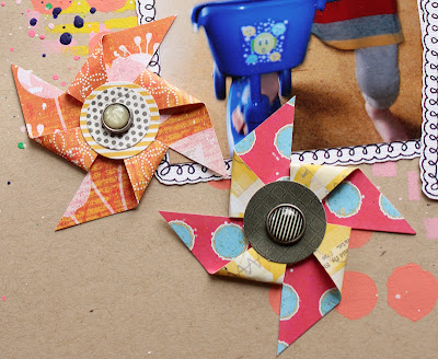
Tutorial pinwheels


I have been asked to make a tutorial of how to make pinwheels for layouts etc. It’s really easy to do!
1.       Cut some squares in the size you prefer. The diagonal length represents the outer measure of the pinwheel. These squares are 5 cm. Choose papers that have colors that you like on both sides as both sides will be visible. If you don’t find the papers you are looking for you can cover one side with washi tape as I did here, or in another creative way…
2.       Draw a line from corner to corner.


3.       Cut along the lines, but only 2/3 of it. Erase the lines but keep the cross in the middle as you will need to know exactly where the middle is.
4.       Fold every other corner in towards the center so they overlap a bit.


5.       Fasten the corners with a brad, or glue them together and decorate with something in the middle. Finished! :)
Here’s my final result:
(You can watch the layout here.)

And here’s another example: (These are 5.5 cm)
(You can watch the layout here.)

Thanks for looking! If you create some pinwheels using this tutorial I hope you leave a message here as I would love to see all different ways to make them!!! Cheers

Monday, 6 August 2012

A little bit ARTastic and a little bit Punky Scraps…

I’m a featured CT member at ARTastic this month! That means that I’m not only writing some words about myself and showing some of my favorite layouts – I’m also hosting the challenge and giving a price to my favorite interpretation this month!!! And what’s more? I have done a tutorial showing one way to work with mixed media that works as an inspiration together with the chosen painting! So it’s fun, fun, fun over at ARTasic this month!!!
Jane has actually said that she wants ARTastic to move more towards mixed media so if you are into that I hope you join in this month to show her that’s what you want! And if you haven’t tried it yet this will be the perfect moment! :)
The inspiration painting is “Om färgernas mörkerseende” by C. O. Hultén. I LOVE his paintings and I actually have some of them as he was a friend of my grandpa! You can read more about that here.
You find the tutorial here. I will also post it in my next blog post together with my own take of the challenge. :)
As you are here at my blog I thought I should give you more than the “formal” information I share at ARTastic… So here are some secrets about me:
1.       When I create with paint and other messy medias I sit on the floor. I have a piece of plastic covering the floor so that I can go crazy with whatever I want to do… And I don't have to clean it up!
2.       I eat a lot of chocolate – and I try not to stain the layouts.
3.       I’m practicing my doodling during meetings at work...
The last thing I want to share with you today is this LO that I made for Punky Scraps Blog Hop’s Sketch challenge.

If you follow my blog you know that I love Punky Scraps challenges! If you still haven’t checked them out I definitely think you should! Just read their description of the challenge site and try to resist this:
“This is your challenge blog aiming to encourage inky, painty, arty creations and make you scrap out of your comfort zone!”
I hope this gave you some inspiration!!! And I really hope you’ll play along at my challenge over at ARTastic!!!!!!!!!
(I will soon post a tutorial of the pinwheels too..!)

Thursday, 2 August 2012

Helpful (My first CT layout for KIU)

August challenge is up at Kraft It Up! This time it’s a sketch challenge. My LO is a bit different from what I usually create – I haven’t used any acrylic paint! :o When I saw the sketch I immediately thought of this stamp from Basic Grey that I have wanted to use together with ProMarkers for quite some time. I didn’t know if it would work to use ProMarkers at Kraft paper – but it did! So the reason for not using paint is that I didn’t think it would look good together. I promise there will be more messing around over here in the future. In fact I already got my hands covered with paint today! ;)
I proudly present my first CT layout for KIU:
And here’s some close ups:
If you follow my blog you know that we have had our kitchen renovated this spring. You can see the result in the picture (or at least part of it). :)
I keep this post short so that you will have time to pop over at KIU’s blog and be inspired of the rest of the CT examples!  ;) I hope you want to play along!!!
Thanks for popping by! I love reading your comments!!! :)