Wednesday, 31 December 2014

Happy New Year!

I wish you all the best for 2015!!!

I have chosen my 10 favourite layouts from 2014. You’ll find them on a page (look above) or follow this link.

I have one new layout to show you too. It is about DD losing her first teeth. It was the day before Christmas so we were wondering if the Tooth Fairy and Santa Claus would meet in our place during the night. And they did – in the morning we found that they had shared a cup of tea beside the Christmas tree!

 
Thanks for stopping by and take care!

Sunday, 7 December 2014

Christmas morning

Hi everyone! I got some news for you. From December I will run Allt Om Scrap, the Swedish challenge and inspiration blog. Working language is Swedish, but I will fix a translate buttom. And pictures speaks a transnational language. :) I hope you will stop by over here now and then, and you are welcome to take part in our challenges!

Our challenge for December is to create on the theme: sparkle and shine. Here is my layout:


I used some golden acrylic paint on the background and added some golden glitter in the wet paint. Here are some close ups:


And here is a photo of the paint and glitter before finishing the layout:


The journaling capture some fun centences that our daughter said last Christmas. It says: "How can Santa Claus afford so many Christmas gifts?" and "Mom, if you wish it as a Christmas gift from Santa Claus, you do not have to pay". (I hope you manage to understand my translision).

Thanks for stopping by! Take care!

Wednesday, 3 December 2014

Decorating the Christmas Tree

This is my DT layout for ARTastic in December. We have an inspirational color palette based on an inspirational piece by Ethel Powers 'To wish you a merry Christmas'.


 And a close-up:


Thanks for stopping by! I hope to see you play along!

Sunday, 30 November 2014

Monochromatic black

Todays challenge at Allt Om Scrap is to create in monochromatic black. I made a layout using only black (and white). I didn’t even use grey. Even the water color on the background is black. It was really fun and not as hard as I thought it should be. Here is the result:

 
And some Close-ups:


Thanks for stopping by! Have a nice day!!

Saturday, 29 November 2014

Blossom

Scrap Around The World has a gorgeous mood board for November and I manages to finish a layout just in time. When I saw all the flowers it inspired me to use photos from our garden as "patterned papers" behind the photo. (Gardening is my second hobby). Here is my interpretation:


And here is the mood board:


I chose some photos in the "right" colors and printed them on white papers as I wanted them to look like patterned papers and not like photos.


As usual, I worked with water colors and stamps. When I chose embellishments I chose word stickers that fit both the photos from our garden and the photo of our daughter.

Thanks for stopping by! Take care!

Sunday, 23 November 2014

Spoiled

Jeany, one of the DT-girls over at Allt Om Scrap is a textile designer. Today we interpret one of her designs. As the design is kind of romantic I tried to catch the same feeling in my layout. I also stuck to the colors.

 
Jeany's design:
 
And some Close-ups:


I love this alpha stickers! When I bought them I didn´t know that they were transparent. But now I´m addicted to them. Now I can write a big title that do not dominate the layout. The title/text says “You are SPOILED but you are worth everything in the world.”
 
Thanks for stopping by! Have a nice day!

Monday, 10 November 2014

Design Team Call på Allt Om Scrap

Allt Om Scrap söker nya designers till sitt team!! För mer information klicka här.

Saturday, 1 November 2014

Sleeping over

This layout is made for ARTastic. The inspiration this month is an art piece by Antje Collis. The criteria is doodling. I thought the painting was funny so I chose a photo that captures a happy feeling. I doodled a circle around the photo to highlight it. I also stuck to the colors in the painting, but that it is not required.


Here are some close-ups:


Thanks for stopping by! Have a nice day!!

Monday, 27 October 2014

Witch

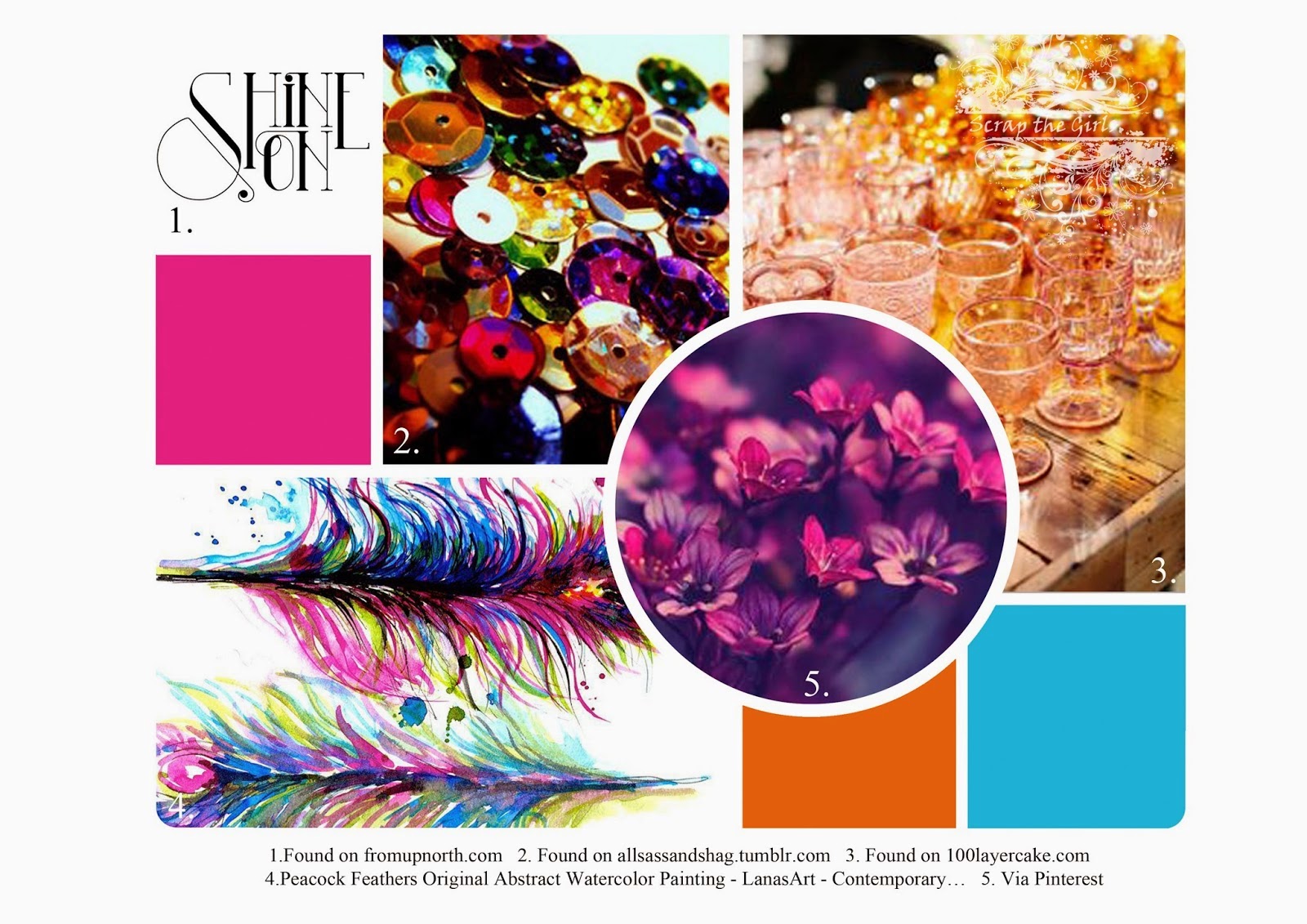
Scrap the Girls has a moodboard to inspire you this month. I loved the colors - especially the little touch of gold. Here is my take on the challenge:


Did you notice the gold arrows? I thought they were stickers when I boght them, but they turned out to be rub-ons. I have not used that for ages, but I loved the way it turned out on the page. They look like they were stamped, but even better!


Thanks for stopping  by! Have a nice day!!

Saturday, 25 October 2014

Best friends

This layout is made for October's challenge at Scrap Around The World. They have an awesome moodboard and I used all the colors (including the lime green in one of the pictures). I also added one butterfly (on a brad).


The photo shows my daughter (to the left) and her best friend. Last summer they were inseparable and I thought this photo where they wear simular dresses is perfect for the theme on the layout.

Here are some close-ups:


Thanks for stopping by! Have a nice weekend!!


Tuesday, 7 October 2014

Vintage photo

This month at ARTastic you should be inspired by the artwork Under a jacaranda tree (1903) by R Godfrey Rivers and use a vintage photo that is more than 30 years old. This is the first time I have created a layout with a vintage photo. :) I used a photo that my mum took of the rest of the family. It shows my father, me when I was two years old, and my older sister.


Here is a close up:

The technique used is the same as usual, with water colors and stamps. I used the same colors as the inspiration picture, but that is not asked for.

Thanks for stopping by! Have a nice day!

Thursday, 25 September 2014

End of summer

Here is another layout I made for Allt Om Scrap this month. This time we had a mood board as inspiration. You should also use a photo taken in the end of summer. The mood board made by Jeany is awesome. You will find it here.

Here is my interpretation:


I loved the color combination and I thought it would work perfect together with this photo with a bit of a mysterious feeling. Here is a close up:


Thanks for stopping by! Have a nice day!

Sunday, 21 September 2014

Remember last summer

Today I show you a layout I made for Allt Om Scrap last Sunday. (I have another one published there today that I will publish here in a couple of Days.) Last Sunday the theme was "Remember last summer" and you should also use a technique that reminds you of summer. Fun twist isn't it?


I used light blue watercolour and splashes of mist to create a feeling of water (that reminds me of summer).

Here are some close ups:


Thanks for stopping by! Take care!

Tuesday, 19 August 2014

Art Journal: Jump

Today I want to show you an Art Journal made for SODAlicious Art Channel No 55. The theme is “Jump” and the text on my page says “The best jump is into the sea”.


I used watercolour, acrylic paint, mist and ink to create the background. It is also decorated with stamps and washi tape.

Thanks for stopping by! Take care!

Saturday, 16 August 2014

Borgholm castle

This layout is made for Let´s get sketchy’s week 2 sketch for August. The banner in the sketch made me associating to knight flags (as the photo is taken in an old knight castle). When my creative process was over there were no knight flags on the layout, but the colors that are usually used in knight flags dominates the layout. Here is my interpretation:


On the background I used grey watercolour. I then decorated with red yellow, green and blue acrylic paint. And a lot of stamps.

Here are two close-ups: 

 
Who is peeking out behind the wall? Well, thats my husband, and me and our daughter did not notice until afterwards. :) As I say in the layout - I love them both because they are so silly (among other things).

Thanks for stopping by! Have a nice weekend!

Friday, 8 August 2014

Mini train - a favorite

The inspiration piece at ARTastic’s this month is a piece of fabric art “Gypsy Caravan” by Kristen Doran. The criteria is to use fabric in some way on your layout.

I chose to use the colors in the inspiration picture but that is not asked for.


Here is a close-up:
 
I used two fabric hearts to meet with the criteria.

Have a wonderful weekend!

Wednesday, 30 July 2014

Midsummer girl

This layout is made just for fun. I used a photo of DD with flowers in her hair taken last Midsummer Day. I thought the photo looked romantic and it inspired me to make a more romantic layout than usual.


To create my background I used watercolour, mist and ink. I also tore apart some romantic 3x4 cards. Here are some close ups:
 

Thanks for stopping by! Have a nice day!