Thursday, 25 April 2013

Biggest chocolate ever..?

I loved Palette #148 over at The Color Room so I decided to play along. It contains peachy pink and some sage green. I thought it was perfect together with this photo of DD taken this Easter. I gave her this huge chocolate rabbit and it was of course an appreciated gift.

Thank you SO much for visiting and for leaving comments!!! Take care!!

Monday, 22 April 2013

Driving RC car

This layout is made for Veckans skiss. The photo shows DD and my father playing with her RC car. With one man and one car in the photo I took the opportunity to make a more masculine or "car-ish" layout.
I followed the sketch quite closely. All three papers behind the photo are there. You’ll also find two banners and an arrow. Here’s a close-up:
I wish you all a wonderful week! And I want to say a huge thank you to the DT girls over at Veckans skiss for making me “the choice of the week” last week!

Thursday, 18 April 2013

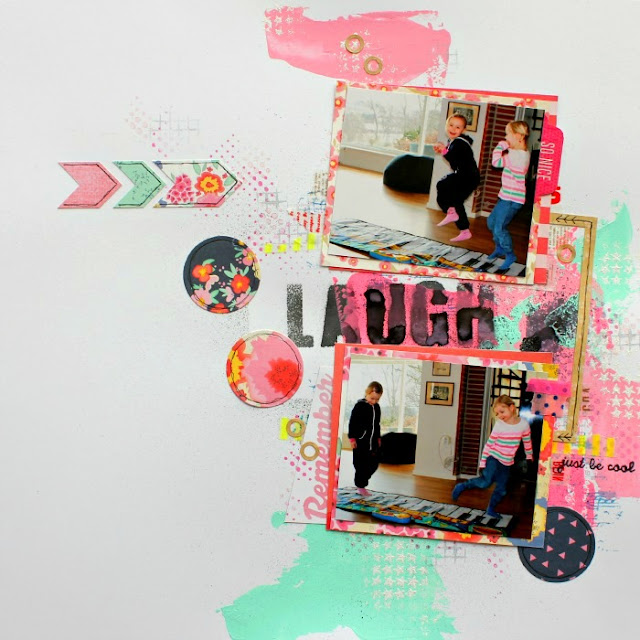
Piano carpet

This layout is made for sketch challenge # 12 at ScrapFriends. I turned the sketch around to fit my photo, so that everything is on the right side instead. I used paint to create the diagonal lines. I have no title but I have text on the same place as in the sketch.
And a close-up:
Thanks for looking! Have a nice day!!!

Sunday, 14 April 2013

Yellow, turquoise, grey and triangles

Today I’m going to show you a layout I have made for Allt Om Scrap. This was a challenge that I really enjoyed! It feels so fresh and captures a lot of this spring’s scrapbooking trends. Yellow, turquoise, grey and triangles. I used a photo taken at this year’s egg hunt. I thought these colors would look fresh with an Eastern photo and they are also found on the egg – terrific coincidence.
And a close-up:
Thanks for looking! I wish you a fabulous week! :)

Friday, 12 April 2013

4 new layouts

I’m here to show you four new layouts.
I’m starting off with a layout that I have made for a sketch challenge at Veckans skiss. The sketch is dominated by a lot of hexagons but I’m all into triangles at the moment so I switched the geometrical figures into triangles instead. I hope that’s okay.
Sketch:
The second layout is a DT layout for Punky Scraps. It’s a sketch challenge and we are asking for a LOT of yellow and some feathers or other eastery stuff. I have used a patterned paper with feathers and a photo of DD dressed like an Easter witch.
Sketch:
The third layout is a DT layout for Allt Om Scrap. This too is a sketch challenge. (I really love sketch challenges. :)) I used this one to create a feeling that DD is jumping out of the layout.
Sketch:
The last one is my DT layout for ARTastic. We have a cool Mandala painting as an inspiration piece this month. It’s made by artist Trevor Nickolls. The criteria is to use the colors in the painting. You doesn’t have to use the mandala pattern but it can be a cool effect if you want to. :)
Have you noticed that my layouts have become lighter lately? Well, we just renovated our house and my scrapbooking room went from this…
… to this. (The windowsill has not arrived yet.)
This has affected me so that I have begun to make lighter layouts using more white. I asked DH what he thought of it and he first told me that they were too white, I continued experimenting and then he said that there were too many straight lines. Then his opinion was that there was too much empty space. But now it seems like he likes it. Of course my aim is not that he shall be satisfied with how it looks, but sometimes it’s easier to find your own path when listening to what other people think. Then you suddenly know if you agree or not and you know in what direction you want to go. It would be really fun to hear what you think too! And maybe you want to share some thoughts about what you think of using white on your own layouts?
I wish you a wonderful weekend full of scrapbooking and nice “little things”!!

Tuesday, 9 April 2013

Recycling at KIU!

There is a really cool challenge up at Kraft It Up! this month. Mel writes that “This month we want to recycle some of that product packaging and use it on your layout, the only must have is that you use Kraft Cardstock or Kraft Patterned Paper!” My DT-layout looks like this:


I went crazy using product packaging from different brands. In fact I only used product packaging as embellishments (except for two feathers). My attempt was to include all my favorite brands but I guess I missed some... The photo shows part of my scrap room after it was renovated.


And a close up:


Thanks for looking!! I hope to see you play along!

Thursday, 4 April 2013

3 layouts for Allt Om Scrap’s web magazine

I’m behind showing DT-layouts. Last Sunday there was a new web magazine published at Allt Om Scrap. I had three layouts published.
The first theme was to use washi tape. I love washi tape so I did a LO using only that. Even the Polaroid frame is made of washi tape. I just cut out a template and covered it with washi tape.
The second theme was called “Getting’ messy”. I covered the whole background PP with gesso, and then I added some mist and a lot of acrylic paint. I didn’t use any embellishments as I wanted the message to stand out. The only decoration is some doodling. DD often say things like: “Mummy is the best” and “I always want to be with you, mummy”. The massage on the layout is that I never want to forget about that.
The last LO is about spring. I used a patterned paper as a background. Behind the photo I added gesso, acrylic paint and some ink.
Thanks for popping by! Don’t forget to take a look at the web magazine. There are a lot more to look at!!! In addition to the other DT-girls’ awesome contributions there are an interview with Ronda Palazzari!